生成AI初心者が話題の生成AI(ChatGPT+Claude 3+Midjourney)を使ってサービスのロゴを作ってみた
 シェア
シェアイントロダクション
私の名前はサトシ。今年で36歳。 遂に、長年の夢であった起業を実現した。 ずっとマーケティング周りの事業に従事しており、Webマーケティング、SEO、SNS運用などにはある程度知見があった。
前回に続いてオレの起業奮闘記を聞いてほしい。前回はChatGPTの助けを借りて、なんとか事業計画書を作り上げ、キャッチーなサービス名も思いついてビジネスは軌道に乗り始めたかに見えた。でもよく考えたら、大事なロゴを忘れていた!
企業のアイデンティティーを表すロゴは超重要なのに、なんでこんな大事なもんに気づかなかったんだろう。でもくよくよしたってしょうがない。今後メディア露出も考えているからこそ、最高のロゴを作る絶好のチャンスだ。
ChatGPT、Claude、Midjourneyって最新の生成AIを使えば、斬新でインパクト抜群のロゴが作れるはずだ。ChatGPTとClaudeの言語生成力とMidjourneyの画像生成力を組み合わせりゃ、世界で通用するロゴが出来上がるらしい。
AIの力を存分に使って、話題性と記憶に残るロゴを作り上げりゃ、サービスの認知度が高まるはずだ。
最近話題のClaude 3でロゴのイメージを決める
ロゴのイメージを具体化する際、最新の生成AI「Claude 3」の力を借りることにした。Claude 3は言語処理能力に優れ、自然な対話が可能なAIとして注目を集めている。
「おいClaude、オレのサービスにバズるようなロゴのイメージを考えてくれへんか?」と聞いてみた。
バズるようなロゴを作るために重要な要素をいくつか教えてくれた。
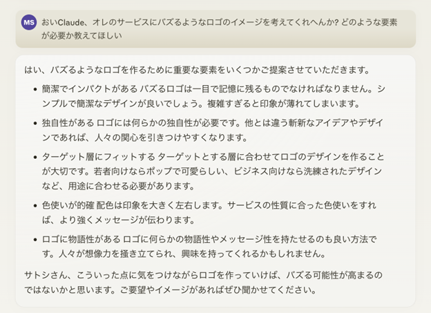
なるほどなるほど…ロゴを作るには、シンプルでありながら印象に残るようなストーリー性や色合いが必要なのか。
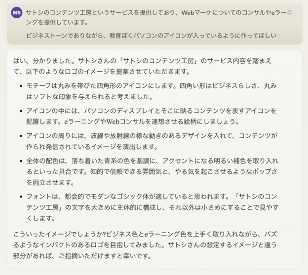
現在提供しているサービスは、Webマーケについてのコンサルやeラーニングだ。誰でもWebマーケティングができるようになってほしいという想いを入れつつ、ビジネストーンでありながら、教育っぽくパソコンのアイコンが入っているように作ってほしい。
簡単には作れないのは理解しているが、AIの力を借りて理想のロゴを作成したい。よし聞いてみよう!
いい感じだ!この5つの項目を元にMidjourneyで作成してみよう!
特に、以下のようなアイコンが第三者からどのようにみられるのかを教えてくれるのは助かる。
- 四角い形はビジネスらしさ、丸みはソフトな印象を与えられる
- アイコンの周りに、波線や放射線の様な動きのあるデザインを入れて、コンテンツが作られ発信されているイメージを演出
- 知的で信頼できる雰囲気と、やる気を起こさせるようなポップさを両立させます。
- フォントは、都会的でモダンなゴシック体
あ、そういえばChatGPTだとどんなアイデアをくれるのだろう。せっかくだし、Claude3とどのような出力の違いがあるかみてみるか。
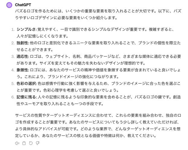
言っていることは似ているけど、ChatGPTの方が一般的な感じがする。アイコンについて、どのようなアイデアを教えてくれるのだろう。聞いてみよう。
なんだろう…参考になるような、ならないような…色合いやアイコンについては、具体的な参考例を出してくれたものの、フォントやロゴの形については漠然としたアイデアしかない。
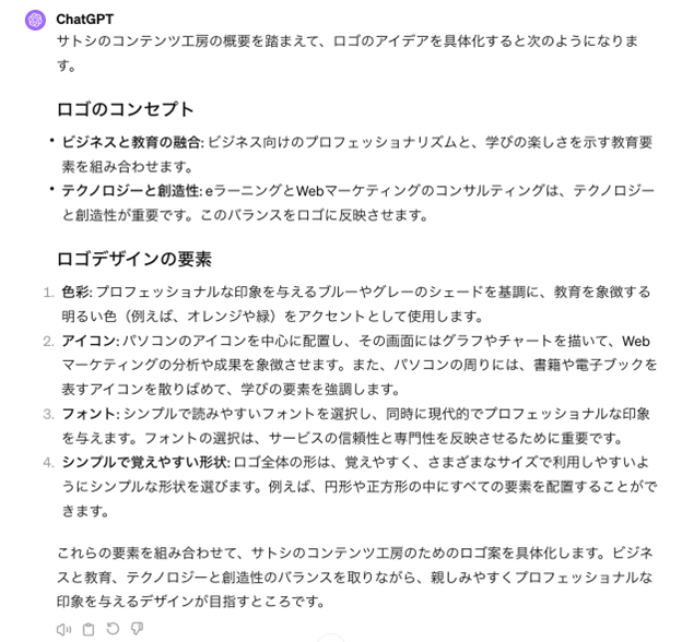
Claude 3のプロンプトそのままだったからだろうか。もう少し、プロンプを変えて聞いてみるか。
Claude 3は「フォントは、都会的でモダンなゴシック体」「四角い形はビジネスらしさ、丸みはソフトな印象を与えられる」など、わかりやすく書いていたがChatGPTは一般的な専門知識しか教えてくれない。
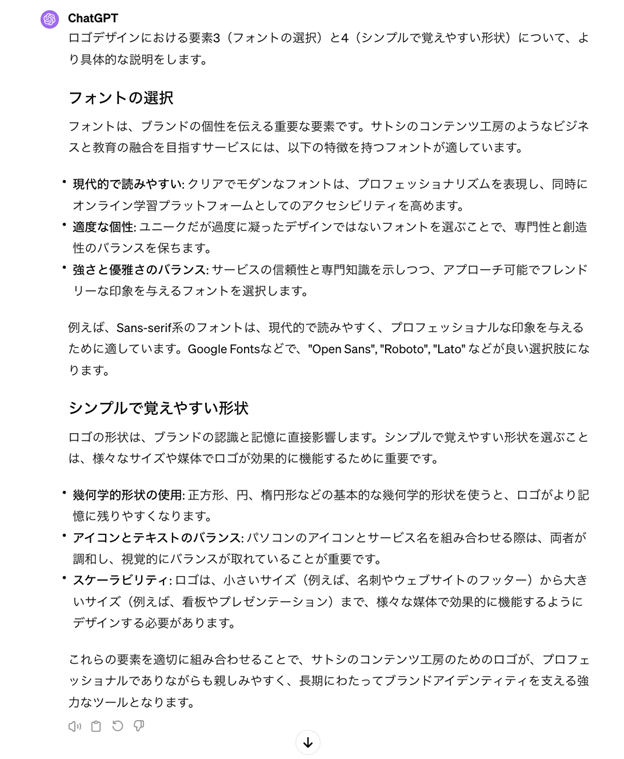
ChatGPTで画像を生成してみる
あまり直感的に理解できないな…そうだ!
DALL-E 3を使って、どんなイメージを持っているのかを教えてもらえばいいのか。お願いしよう。
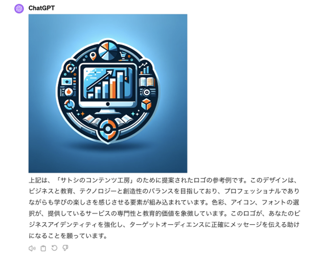
…なんともいえない。Claude 3が提案してくれたロゴのイメージも作成してもらおう。
先ほどとテイストが似ているが、下にSATOSHI’S CONTENT STUDIOと入っているのが良い。もう少し洗練された感じのロゴがいいなあ。生成されたアイコンには余白が少なく、圧迫している印象がある。これだと、スパルタで知識を詰め込むスクールと思われないかなと不安。
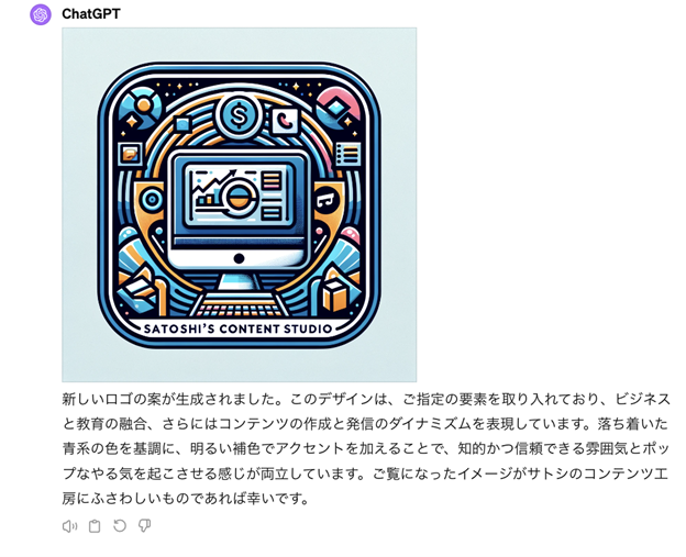
やはりアイコンやイラスト生成はMidjourney一択なのか。
より精度を上げるためにMidjourneyを活用
Midjourney用のプロンプトはChatGPTとClaude 3にそれぞれ作ってもらうか。Midjourneyのプロンプトは、詳細に記載した方がより理想に近い画像が生成できると聞いたことがある。自分の脳内で単語を羅列するよりも、AIに頼って網羅的にキーワードを出してもらった方がきっとより良いアウトプットができるはず。
ChatGPTが生成したプロンプトは以下の通りだ。
「Create a logo that combines business professionalism with a touch of softness. The motif is a rounded square icon, symbolizing both the structured nature of business and the approachability through its rounded edges. Inside the icon, incorporate a computer display showcasing icons that suggest e-learning and web consultancy, such as graphs, educational symbols, and digital interfaces. Surround the icon with dynamic elements like wavy lines or radial patterns to convey the movement and dissemination of content. The color palette should be centered around calm shades of blue, complemented by bright accent colors to balance a trustworthy and intellectual ambiance with an energizing pop feel. Use a contemporary, urban gothic typeface for the text “Satoshi’s Content Studio,” prominently displayed in a larger size for main visibility, with secondary text smaller for clarity and ease of reading. The overall design should convey innovation, trustworthiness, and the dynamic nature of digital education and web marketing consultancy.」
どんなロゴができるのか楽しみだ。お、生成されたぞ!
かなりいいのではないか?!
上2つのロゴは、ビジネストーンで洗練されている気がする。
一応、Claude 3にも同じ条件でプロンプトを作成してもらおう。
「A rounded rectangular icon with a computer display inside showing content symbols representing e-learning and web consulting services. Around the icon, wavy lines and radiating patterns representing the creation and delivery of content. The overall color scheme is blue tones with bright accent colors, conveying an intellectual and trustworthy vibe with a pop of energy. The text “Satoshi’s Content Factory” in a large modern gothic font as the main element, with smaller text for additional details. The logo should have a business-like feel with a soft side, balancing professionalism and approachability. Isometric projection, 3D render, vector line art style.」
ChatGPTと同じプロンプトを使ったのに、解釈がかなり違うのが興味深い…!
お!画像が生成されたぞ。こっちの方が、サイバー感強めだ。

全て斜め上からのアイコンなのが気になるので、微調整していこう。色合いを青と白、そしてパソコンの画面を正面から見て、プロンプトを作成し直してもらおう。
「A rounded rectangular icon with a front-facing computer display showing content symbols for e-learning and web consulting services inside. The icon has wavy lines and radiating patterns around it, representing content creation and delivery. The overall color scheme is shades of blue and white, giving an intellectual and trustworthy feel with a pop of energy from the bright accents. The text “Satoshi’s Content Factory” is rendered in a large, modern gothic font as the main element, with smaller supportive text. The logo balances a professional business-like appearance with an approachable soft side. Isometric 3D vector line art style.」

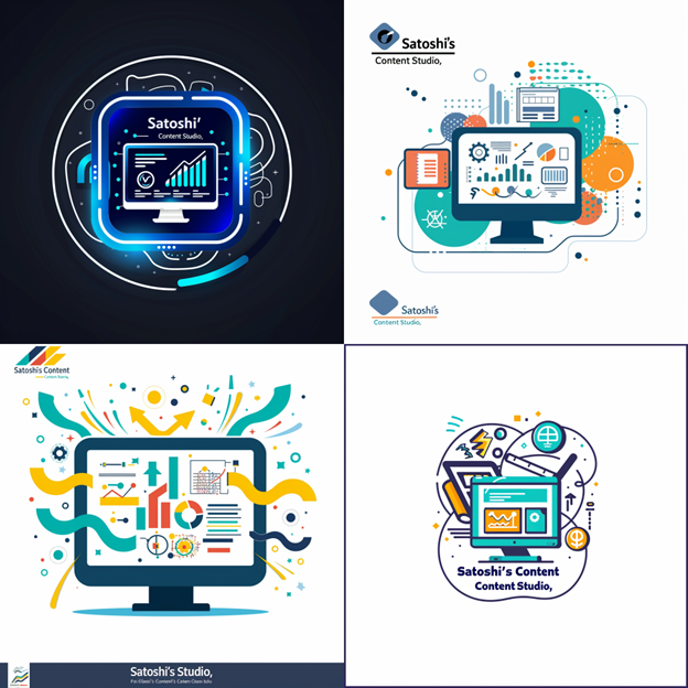
どうしても斜め上から出力されてしまう…ChatGPTが生成したプロンプトを元に再度作成してもらおう。
「Create a logo that combines business professionalism with a touch of softness, focusing on a color palette of blue and white. The motif is a rounded square icon, symbolizing the structured nature of business and approachability through its rounded edges. Inside the icon, feature a computer display with icons that suggest e-learning and web consultancy, such as graphs, educational symbols, and digital interfaces, emphasizing the themes of learning and digital communication. Enhance the icon with dynamic elements like wavy lines or radial patterns in shades of blue and white to convey the movement and dissemination of content. The primary colors should be calming shades of blue with white as the primary accent, to project a trustworthy and intellectual ambiance while also infusing the design with a sense of energy and modernity. Use a contemporary, urban gothic typeface for the text “Satoshi’s Content Studio,” prominently displayed in a larger size for main visibility against a simpler, smaller secondary text for clarity. The overall design should emphasize innovation, trustworthiness, and the dynamic nature of digital education and web marketing consultancy, all while maintaining a clean and crisp aesthetic with the blue and white color scheme.」
かなりいいぞ!ユニークながらマーケティングや分析をしていることが伝わってくる。今回はこの4つのなかで決めよう。
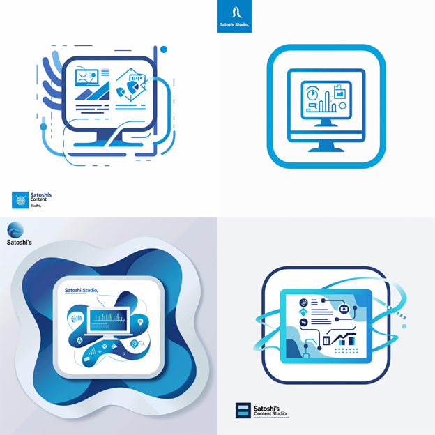
個人的に、右下がお気に入りかな。このロゴで走らせてみよう!

まとめ
よし。ロゴもできたところで一安心だ。
デザイナーに頼らず、AIツールだけでここまでできるのが本当にすごい。企業規模が大きくなったタイミングでプロに頼むのはありだけど、小規模から始めたい場合はとてもありがたい存在だ。
簡単なロゴを作るにも数万円は必要なので、生成AIを活用することで、圧倒的なコスト削減を実現できる。
本当にAIツールは弱者を救済する素晴らしいツールだと実感。
次は、サービスを的確に伝えられる紹介文が必要な気がする。
これもAIツールにお願いすればできるのかな。一人でもどんどん事業を進めていけるのが楽しい。
次回作でまた会いましょう!
- 記事執筆・監修
-

- 茶圓 将裕 MASAHIRO CHAEN
- 株式会社デジライズ 代表取締役、AI-zen株式会社 代表取締役、Eat&Smile 共同創業者、GMO AI & Web3株式会社顧問 その他数社の経営陣、顧問を兼任 X(旧Twitter)で9万人以上のフォロワーを有するビジネス系AIインフルエンサー。AI専門家として、ABEMAニュース、TBSテレビ サンデー・ジャポンなどのメディアにも出演。
-


- ※本記事は、起業の窓口編集部が専門家の監修または独自調査(アンケート)に基づいて制作したものです。
- ※掲載している情報は、記事公開時点の法令・税制・商品・サービス等に基づくものであり、将来的に変更される可能性があります。
- ※アンケート調査に関する記述は、特定の調査対象者からの回答結果および編集部の見解を含んでおり、内容の正確性・完全性を保証するものではありません。
- ※記事の内容は一般的な情報提供を目的としており、すべての方に当てはまるものではありません。個人の状況に応じた具体的な助言が必要な場合は、専門家にご相談ください。
- ※情報の利用や判断、実施については、ご自身の責任で行っていただきますようお願いいたします。
- ※本記事に掲載された内容の転載・複製はご遠慮いただき、引用の際は必ず出典をご明記ください。